Release date: January 29, 2014 (build 7.7.5639)
You can switch to the legacy mode using CssOnly = false.
The support for the legacy mode will be phased out in the future.
To make the transition easier, you can use the Traditonal CSS Theme based on the default legacy look:
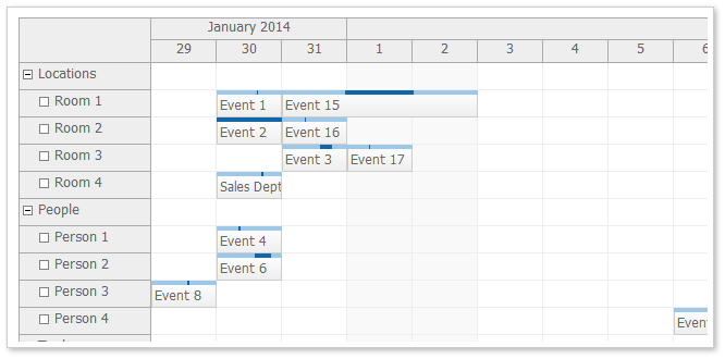
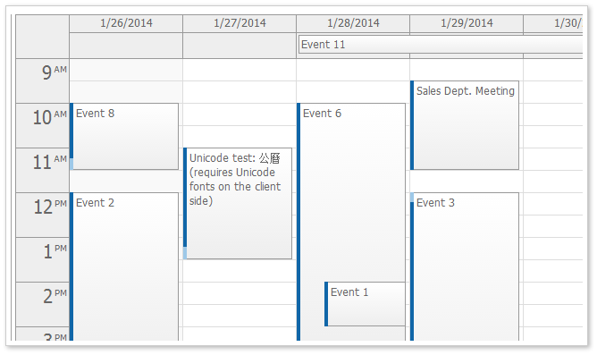
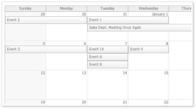
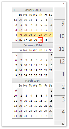
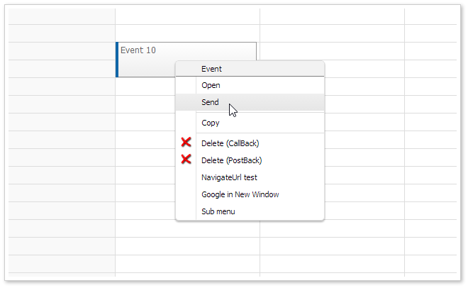
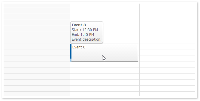
The date picker uses the navigator_default theme as it is based on the Navigator.
The default theme is now used as the starting configuration in the online theme designer.
It is a very simple CSS theme that includes almost no styles. It uses rectangular corner and darker event border.
Daily/Weekly Event Calendar
Monthly Event Calendar
These themes are based on the traditional DayPilot look (in !CssOnly mode). You can use them as a starting point when switching to CssOnly mode.
The themes were created using the online theme designer and tweaked a bit (the duration bar border in calendar and scheduler was added manually).
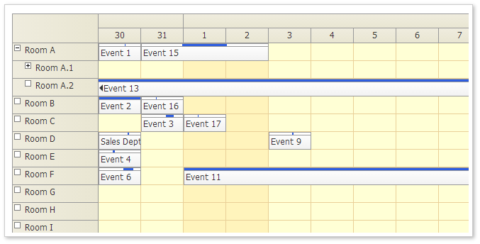
Demo: http://mvc.daypilot.org/demo/Scheduler/ThemeTraditional
Theme Designer: http://themes.daypilot.org/scheduler/theme/m3km5n
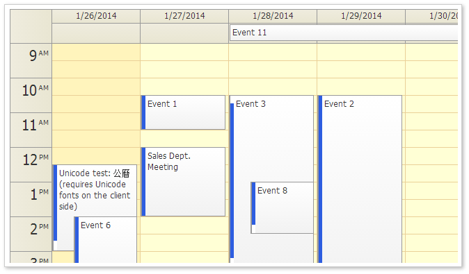
Demo: http://mvc.daypilot.org/demo/Calendar/ThemeTraditional
Theme Designer: http://themes.daypilot.org/calendar/theme/japngi
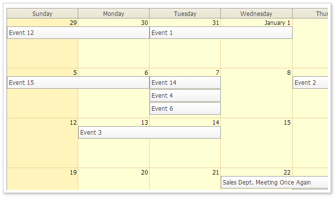
Demo: http://mvc.daypilot.org/demo/Month/ThemeTraditional
Theme Designer: http://themes.daypilot.org/month/theme/bn47e7
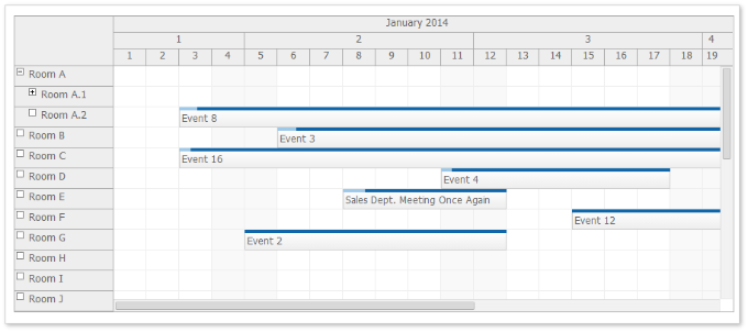
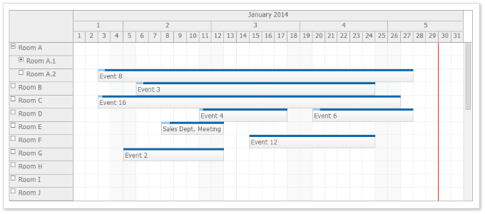
You can use CellWidthSpec="Auto" to adjust the cell width automatically so the full Scheduler width is used.
Behavior:
Demo: http://mvc.daypilot.org/demo/Scheduler/AutoCellWidth
In the previous version long events were sometimes difficult to read because the text was hidden.
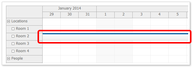
If the beginning of the event is not visible (for long events than span several days) it displays a special floating div over the event that displays the event HTML.
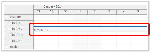
You can enable/disable it using FloatingEvents property. It is enabled by default. You can test in the main Scheduler demo page:
In the previous version long header cells were sometimes difficult to read because the text/HTML was hidden.

If the beginning of the header is not visible (for long headers, especially month and year time header groups) it displays a special floating div over the event that displays the event HTML.

You can enable/disable the floating time headers using FloatingTimeHeaders property. It is enabled by default. You can test in the main Scheduler demo page:
Calendar, Month, and Scheduler now use MoveBy="Full" by default.
Scheduler
Calendar
Month
You can specify selection dimension properties in the CSS. This is helpful if the CSS is designed to work with different than default dimension. It will soon be added to the online theme designer as well.
This CSS value will override the value specified using the calendar object.
Event Height (.eventHeight property):
*_event_height { height: 25px; }Header Height (.headerHeight property):
*_header_height { height: 20px; }Replace the asterisk with the theme name.
All-Day Event Height (.eventHeight property):
*_alldayevent_height { height: 25px; }Header Height (.headerHeight property):
*_header_height { height: 20px; }Replace the asterisk with the theme name.
Event Height (.eventHeight property):
*_event_height { height: 25px; }Day Header Height (.headerHeight property):
*_header_height { height: 20px; }Replace the asterisk with the theme name.
When dragging an event over a row that has child nodes it is automatically expanded after a short delay.
The business cells are marked with a special CSS class.
*_cell_business
It is applied at the same level as *_cell so you would define the business cell style like this:
.scheduler_default_cell.scheduler_default_cell_business {
  background-color: #fff;
}
This class is not applied when you use .drawBlankCells = true and don't handle .onBeforeCellRender event (for performance reasons).